Observant readers (or at least those who are reading this at wordpress, not a feed reader) will notice a new header (or banner, or whatever you call that photo up top)
The threadspools I put up when I started, where fine, a photo I had and liked, with a clean look and lots of white space for the name (you might also have noticed how much I like white space) and I didn’t think much more about it.

Until I had a really successful photo shoot with this quilt. I looked at this photo, loved it and thought: ‘you know, that would make a good blog header, and hey, it actually has a quilt, not just thread’. Something like this:

Imagine, I'd actually added text over there on the right
And, you know, I still like that photo. The composition’s great for a header. But, well, happy as I am with this quilt, it’s not really an accurate representation of most of my style. If I saw that photo, I’d expect something a lot more traditionally pretty, girly, cottage-y than you’re actually going to get here.
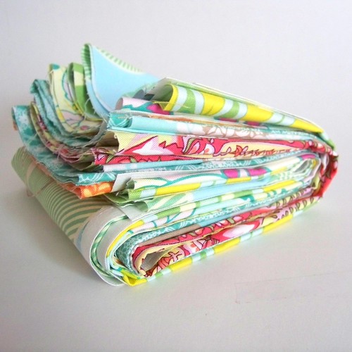
So I grabbed one of my favorite quilts off the back of the couch for a new photo shoot, and got a couple of art-y photo’s I liked.

Mose of which, work terribly for banners. 190 x 760 is an unusual set of dimensions, and clearly not a size I naturally photograph for. Except, folded quilts are one of my favorite things ever, and conveniently oriented for a long, narrow banners.

Success – lots of white, splashes of solid blue-green, my favorite quilt, some open space for text, a quilt photo-header that’s actually representative.
Read Full Post »